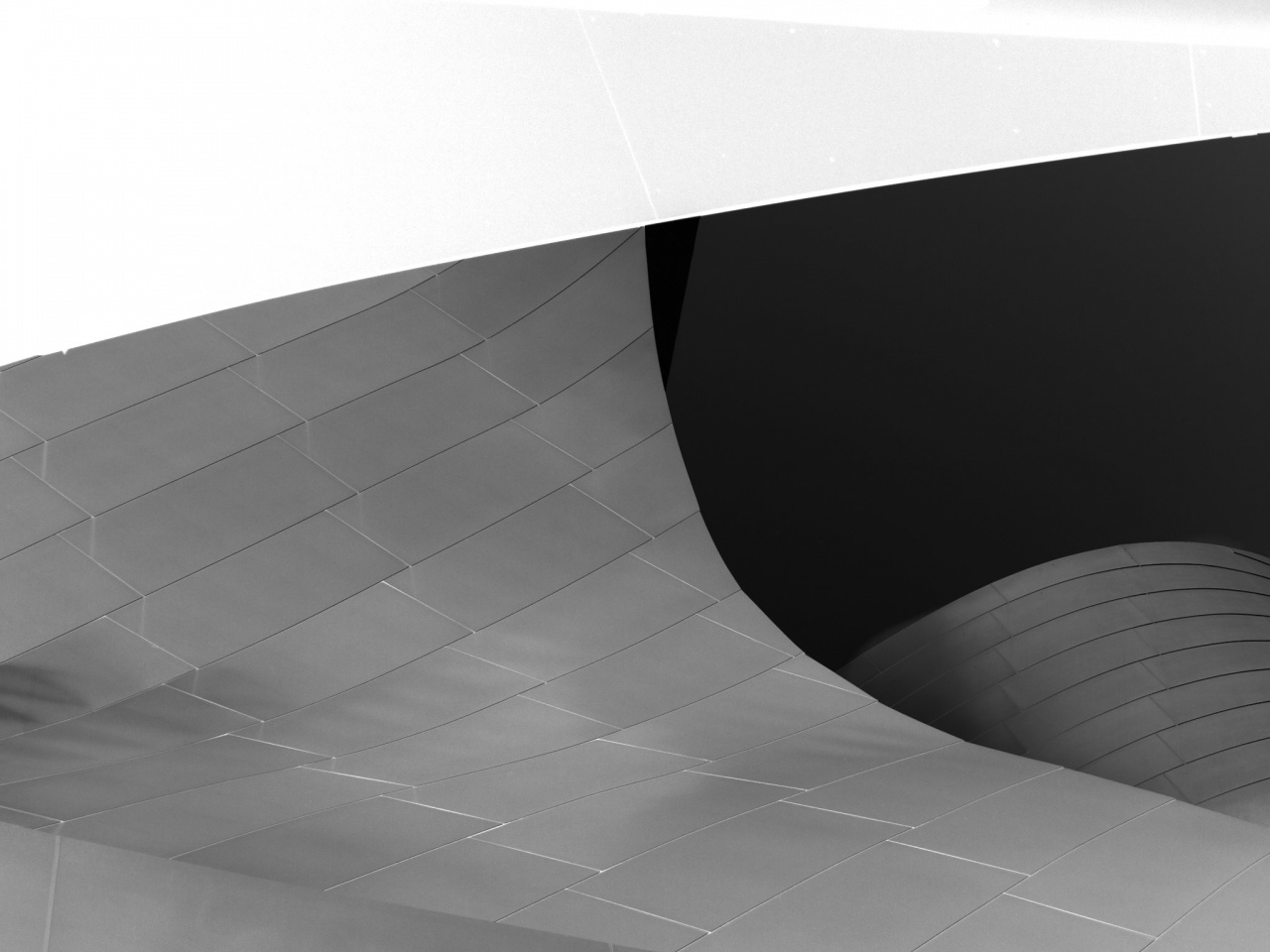
Following up on yesterday’s post, here is another close up study of the Walt Disney Concert Hall, this time with a black and white negative treatment. For the earlier photos in the series, all of which were in color, here are Number 1, Number 2, and Number 3. As much as I like the black and white treatments of the building, the color versions are needed to display the way that the materials used reflect and react to different light.
Also, here is a postcard style view of the entire building, and a photo of a unusual tree in the park behind the hall.


Chris Nitz
11 May 2011I am really drawn to this shot. I don’t know if it is because of the great contrast, the lovely bright white and deep dark black, but I just keep chasing lines around the shot. Great work man.
Chris Nitz recently posted..Ever Watchful
Jim Denham
11 May 2011Contrasting lines are really attractive here! Nice work Mark!
Jim Denham recently posted..Ye Ole Clevis Pin
Brian Furbush
11 May 2011Nice abstract shot here Mark – really enjoying the composition and subtle contrast.
Scott
11 May 2011Love the abstract!
Jim Nix
11 May 2011yep, that’s just cool Mark, great BW too! Jim
Chris Frailey
11 May 2011Love the simpleness of this shot.
Chris Frailey recently posted..Into The Mist
Dave DiCello
11 May 2011This is outstanding, really digging the abstract look!
Steve Beal
11 May 2011B&W version is beautiful… Sweet lines and patterns!
Wayne Frost
11 May 2011Mark, of all the images, I think this is the most powerful. I really like how the tones and shapes play off each other.
Wayne Frost recently posted..Antique Row
Kristi Hines
12 May 2011Great black & white abstract!
Kristi Hines recently posted..The Waves
David LaSpina
12 May 2011Wonderful abstract!
James Howe
12 May 2011I seem to be the odd man out on this one, but I think I would like this image better if the bright top were toned down a bit so I could see some detail and the darkest part brought up just a bit, again to see some detail. I like the composition, but (at least on my monitor) it seems like I’m only seeing half of the picture because the top is so bright. It does make for a really nice abstract image, however.
Mark
12 May 2011I want to thank James for taking the time to write up some constructive criticism. Not that I don’t love all the positive feedback (no really – keep em coming), but some negative feedback is a refreshing change.
To respond, I need to note that the large dark region is the sky, and there really is no detail to bring out. I actually like it as a nearly black large field and getting it that dark was one of the reasons I chose a negative black and white treatment. There is a small even darker sliver which was small enough that I was comfortable having it be pretty much completely black.
I take James’s criticism harder on the bright area. It is huge, and dominates the frame, so I probably should have tried harder to pull in some detail, or at least diminish it’s over-dominant brightness.
James Howe
12 May 2011Now that you mention that the dark area was sky I took a closer look and realized I had some crud on my monitor which made it appear that there was some minimal detail in that area. 🙂