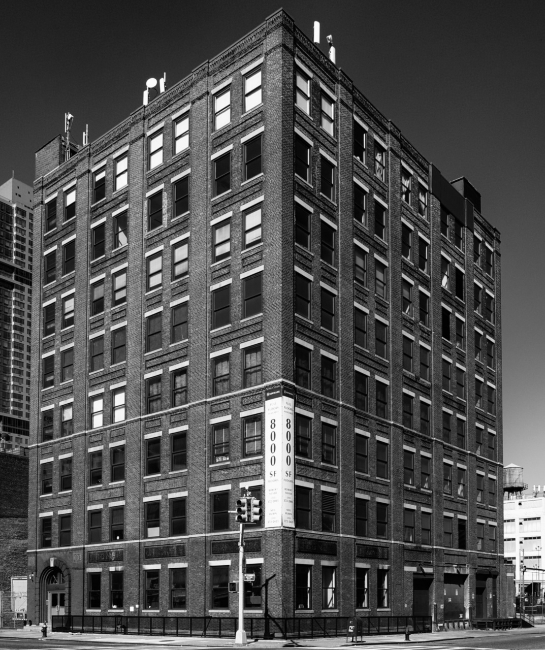
This is one of those occasional shots I post even though I’m not fully satisfied with it. I’m not sure exactly what I want it to be, but I do think it should somehow be better and more interesting. It also is a different take on the building (599-603 11th Avenue) I showed here. I went with black and white more because I could not get the color version into something I liked. No matter how I play with the Lens Correction tool, it ends up looking crooked or off-kilter somewhere. But even if I could fix those items, I think it would end up disappointing. I think I just want it to be more interesting than it is. Any thoughts on this would be appreciated. Thanks and enjoy the weekend.


James Howe
22 Sep 2011I think this is one of those shots where less would be more. I find my eye is drawn to the stop light and the sign on the edge of the building. I think there might be an interesting image from a much tighter crop, possibly incorporating the arched doorway on the left. The shot has lots of interesting patterns, but I think the full shot just has too many things to look at.
Mark
22 Sep 2011Thanks James. I did do a tight cropped shot of that doorway here, http://toomuchglass.net/2011/07/20/599-603/, although now I’m not too pleased with the saturation. I did it knowingly at the time, but now it seems a bit much. Maybe I’ll rework that one as a black and white.