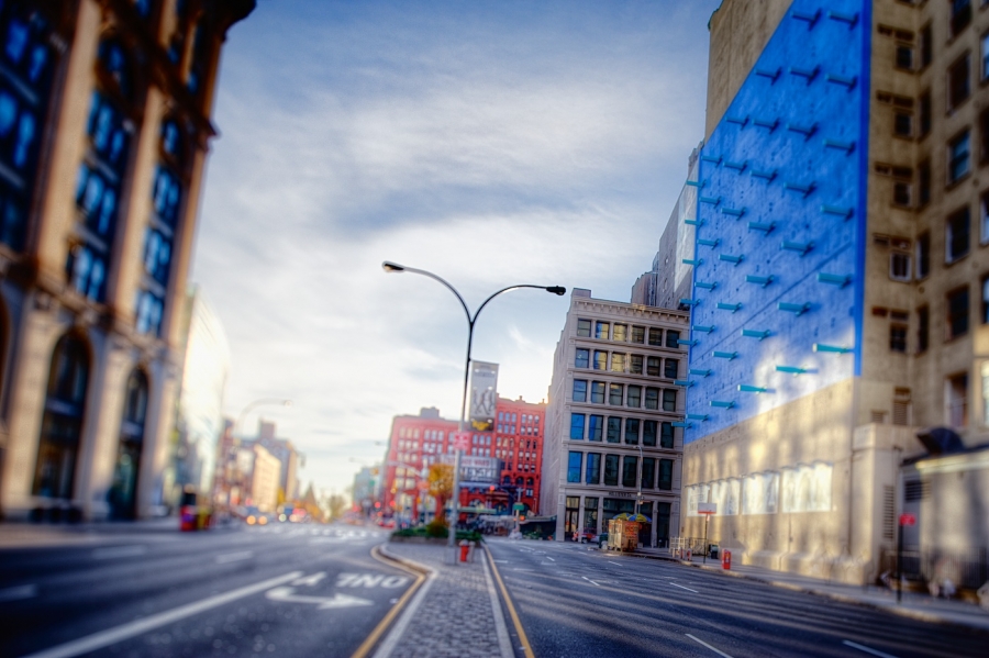
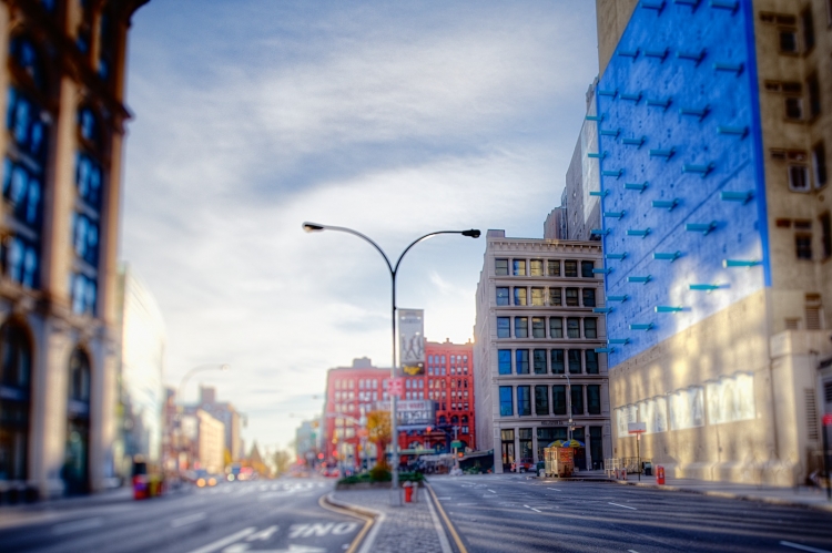
I’ll be curious to get people’s opinions on this one. When I took the shot, I had no idea that everything was leaning so far to the right. It isn’t lens distortion. As you can see below, when the image is simply straightened, everything lines up vertically. Nevertheless, I decided to keep the lean to the right, even though it was an inadvertent mistake. Which do you prefer? In processing, I added a High Key filter at the end to enhance and emphasize the morning light. It ended up washing out a bit of the sky color on the horizon, but it works, I think.
The view is of Houston Street, looking east from a spot just west of Broadway. The structure to the right is a sculpture entitled “The Wall” at 599 Broadway. It has been at this location, with one interruption, since 1973. I first saw it somewhere around 1978-80, and it has always been a personal favorite. It somehow seems both incongruous and completely appropriate. Called by some the Gateway to Soho, to me it evokes that neighborhood’s industrial past.
Finally, this image also displays why I love shooting Manhattan in the early morning so much. It’s the windows. In particular, it’s the reflections. For example, you can see part of the Wall in the building across the street. Also the light coming off one set of windows hits other buildings and creates a speckled effect.


Pat OBrien
22 Nov 2010For some reason Mark, I prefer the tilted one. I think it adds more drama to the photo. I feel like the tilting actually draws my eye to “The Wall” more than the straightened one. Nice work!
Pingback: Tweets that mention It’s the Windows » Too Much Glass -- Topsy.com
Mike Olbinski
22 Nov 2010Like the tilted…the lines from the shadows works will with it too.
Jesse Pafundi
22 Nov 2010I have an extreme OCD about shots not being level so I prefer the straightened version.
Tobias George
22 Nov 2010Prefer the tilt. Excellent shot!
Oscar Navarro
22 Nov 2010I think that I processed an image like this from Scott… I love this one too 🙂 here the link… and let me know if it is the same place http://oscarnav.posterous.com/boston-bad-brackets-the-scott-wyden-challenge
James Howe
22 Nov 2010Normally I would prefer a shot with straight lines, but in this case I prefer the tilt (still with straight lines, just at an angle) because I think it makes the image a bit more dynamic. The image isn’t a pure architectural study so I think the angle works.
Mark Blundell
22 Nov 2010Tilted version for me all the way, it suits the blurred image well, the empty streets giving the feeling of impending disaster – an earthquake is on the way and everyone has evacuated.!
mark
22 Nov 2010Wow. I asked for feedback and you all came through. I appreciate it, and it seems prety clear that except for those who have a strong aversion to off-tilt images, the tilted version is the winner. Which is funny because I never would have thought to do it on purpose. Occasionally I shoot on an angle, but when I do it’s usually way off, like 30-45 degrees off level. This was about 2.5 degrees: enough to notice but not extreme. I’ll have to add this to my toolbox.
Finally, Oscar, this is a different scene from Scott. His shared brackets were from somewhere in Boston. This shot is in New York City.