

This was the 5 minute fix that I worked on for days. But I am really excited about the main fix, which does only take a few minutes both to learn and to implement.
Let’s start with learning the new technique. Last weeks This Week In Photo podcast featured, among others, Richard Harrington, who does a lot of Photoshop teaching. He touted the power of channels on the show, and I downloaded every one of his podcasts that seemed to be about channels, plus several others. One tutorial was about using separate channels in a Levels adjustment layer to fix the color cast of photos. The example he used was for a photo taken in blue hour that had a strong blue color cast.
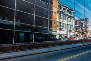
I immediately thought of several of my blue hour images, including this one of the Flatiron Building. (The link goes to the original post from last June, and the image is also shown below).
These images do tend to have a strong blue color cast, and white balance adjustments do not do a very good job of fixing them. So after I watched that podcast, I tried Harrington’s fix on this image, and it worked. It took about 5 minutes to try both methods that he sets forth in the video. Both methods worked on this image, by the way, in roughly equal measure. I’ve tested them on other images, and sometimes one method is better than the other.
But I couldn’t leave it at that. I figured if I was going to fix the image I should fix the image. I though I could improve the sky using some tips I learned from Mike Olbinski’s new tutorial, and I also thought I could improve upon the messy ghosting of various pedestrians in the image. So I tried starting from scratch, and tried to fix everything, but eventually realized that was not worthwhile. The reason the pedestrian ghosting is messy in the original is because of the nature of the brackets. There were lots of people, many in motion, and there was no single good bracket to use as a source. Sometimes you have to accept that good enough is as good as you can get, and this is one instance. I will someday go back and try to get better source brackets, and if that works I’ll explain how I did it, but for now the fixed versions still have ghosting issues. I wish it were better but the picture is all about the building. By the way, I know that this is heresy to some people. I do try to make my images as good as they can be, and reject a fair amount as disappointingly unusable. This situation is something of a special case, however, because the image was already published. Everything is a judgment call. I guess my rule is never to use an image in which I see obvious flaws, except for cases where I decide otherwise. 😉
Then I had trouble with Mike Olbinski’s sky fix suggestions. They work, but his method of brushing in everything either in photoshop or while using OnOne PhotoTools is better suited for wide open Arizona skies than for the jagged, up/down, in/out nature of New York city skies. No matter how careful I tried to be, I ended up with areas on the edges of the buildings where my brush strayed a bit. So I used Mike’s substantive suggestions for how to improve the images, but used Topaz ReMask3 as the way to apply them only to the sky.
In the end, I worked with the original “final” image, which is included below, and applied the Harrington Levels lesson to that, followed by Mike’s sky/cloud suggestions with my adaptation. But no, I still was not done, because I also had to play with my obsession from last week, which is correcting lens distortion. The uncorrected version is on the left, the fix is on the right.
That also was tricky, and I could not fix everything. You will notice that the buildings on the side still lean in, just not as much. The Flatiron itself does seem to stand a little straighter and somehow seems taller, too.
The funny thing is, after doing all this work, which took several hours after a few days, I’m no longer sure I prefer the fixes. Blue is my favorite color so I sometimes like the blue cast that blue hour shots have. And simply, after staring at many, many versions of this one image over several days I have lost all perspective. So, if anybody has actually read this far, for extra credit please leave a comment stating whether you like the color fix, and also whether you prefer the lens distortions corrected version over its new sibling. The “extra credit” reward consists of me saying you get extra credit for doing it. Thanks.
Finally, I should shout out to Tom Baker, whose occasional “Fix-It-Friday” series was an inspiration for this post. The link goes to what appears to be the most recent entry in the series.

Jim Denham
4 May 2011Thanks for sharing Mark! Wish I could try the channel tips, but I do not have that option in Elements. Great post and great image(s)!
Jim Denham recently posted..HDR Screencast
Jim Nix
4 May 2011nice work, thanks for sharing those tips too! Jim
Chris Nitz
4 May 2011Love the look behind the image and how much work went into it. I don’t think it is a matter of fixing ever last issue, but rather making an image you enjoy and can be happy sharing with people. If this is for a client, then you want the best image possible, but even then “perfect” is still subjective to the person viewing it. I like the final image 🙂
Chris Nitz recently posted..Got a Mop Grunge Collaboration
Kristi Hines
4 May 2011Looks very 3D – great job in the rework!
Kristi Hines recently posted..Scottsdale Sunset
Erik kerstenbeck
4 May 2011Hi
These are great shots of this iconic NYC Building. I had the chance to take one myself but from a slightly different perspective. I moved off the traffic island for this one!
http://kerstenbeckphotoart.wordpress.com/2011/04/08/a-really-flatiron-building/
Ryan Sexton
4 May 2011I like the color fix, and the lens distortions corrected.
Ryan Sexton recently posted..911 Fireman Flag Raising like Iwo Jima
Scott Frederick
4 May 2011Nice reworking Mark! Thanks for sharing the video and tip!
Toad Hollow Photography
4 May 2011That’s amazing Mark! Really enjoy the reworked version there, what a fantastic image you’ve created!!
Toad Hollow Photography recently posted..Bear Mountain
Tom Baker
4 May 2011Ha Mark – thanks for the shout out. I’ve been a little lax on posting it on Fridays – though I have been posting some fixed photos lately.
I agree that the fixed one isn’t always the best one – but often times our skills have grown to the point that it’s worth another try. I run into the same sky issue that you have shooting in the city. I’ll have to give Topaz Remask a try.
Finally it’s funny to see you are on a distortion kick too. Now I look at photos and it just drives me crazy.
Nicely done man.
Tom Baker recently posted..POTD- Gaylords
Mike Olbinski
4 May 2011I like both versions honestly….the fixed one has such a very cool, tall, skinny building…and I dig it. But I also don’t mind the distortion in the other ones.
One silly thing I’ll point out since you were asking for critiques…there definitely appears to be a brush stroke around the top left of Flat Iron that looks like just a missed masking issue?
Otherwise, I do love the blue tones too. Well done man.
Chris Kenison
6 May 2011Thanks for sharing this post, Mark. Great job!