
I did not even notice the KISS graffiti until I started processing the image.
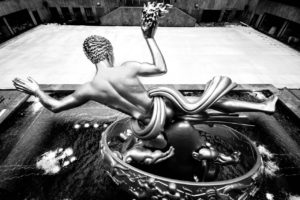
I’m feeling somewhat contrary today so I’m not going to offer my usual explanation of what this is, although people located in New York or New Jersey will probably figure it out. I had never seen this particular location before, and it is an unusual design – I expect the building has been repurposed.
Now some site business, and I’d appreciate feedback. I use a black background because I think it is best for showing off the photos. That means, however, that I also have white text on a black background, which is widely hated (although nobody has specifically complained about my use of it). In fact, I usually cannot stand sites with white text on a black background, but I make an exception for photoblogs, because I figure the images come first and text is secondary. I realize I could use s different color scheme just for the text boxes, but I believe even that much takes away from the all black background for the images. Anyway, for no real reason, I started questioning the decision yesterday and thought I would ask site viewers what they thought. Thanks in advance for any responses.
Chris Nitz
17 Mar 2011Lovely image! I’m really liking the cold tones off set by the warm light. Very nice!
Chris Nitz recently posted..Fire Safety 101
Heath O'Fee
17 Mar 2011I dig the warm/cool contrast here, Mark.
As for the site design…yours is really more of a grey backround, and the slight difference between that and pure black makes a huge difference with the white text. However, if you’re feeling like you want a change, then perhaps you could look into adding some sort of lightbox image viewer that pops the image onto a black background when you click it.
Heath O’Fee recently posted..Tug o’ War
Bob Lussier
17 Mar 2011wow. Love this shot, Mark!
Your design issue … I agree that images present better on dark backgrounds. That said, I went with a lighter color scheme on my Blog, migrating from dark colors. I considered the overall use of the Blog (reading the post, navigation, etc.), not just the images. I also use a thickbox overlay, so users can click on the image and it will pop into a dark background for better presentation (and larger for horizontal images).
Toad Hollow Photography
17 Mar 2011This is a great great photo Mark! As for your site question I really like your setup… it feels very professional, exactly what you’d expect from a top drawer photographer. These things are rather typically a personal taste issue, and I personally really like it the way it sits. Of course, if you change, I will still follow and enjoy your work! 🙂
Toad Hollow Photography recently posted..Whippletree Junction
John Sotiriou
17 Mar 2011Leave the site just as it is! Unlike Toad, if you change it I will never visit your blog again (kidding of course). Is Garbowski an Irish name? If so, Happy St. Patty’s Day. 🙂
Jamie
17 Mar 2011It’s fine to me Mark. Like the others, I’ll still be visiting regardless.
Pingback: To Hudson Tubes - Too Much Glass » Too Much Glass